Tag Archives: iPhone

iPhone app orientation (portrait vs landscape)

Introduction

The UIInterfaceOrientation property that can be put in an iPhone app’s Info.plist file, has lead me into a confusing environment of iPhone app orientation design.
At the top level, there are two ways the orientation can be considered: 1- the physical orientation of the device; 2- the orientation of the on-screen user interface.
And when developing an app, these two things can be inconsistent, and confusing.
The iPhone has 7 different physical DEVICE orientations, 3 of which I am not covering (face-up, face-down, unknown).  The 4 device orientations that are considered in this writing are: landscape-left (homebutton is on right), landscape-right (home button is on left), portrait (home button is down), portrait-upside-down (home button is up).
The iPhone has 4 different interface orientations. Two are portrait and portrait-upside-down that equal the physical device portrait orientations.  The other two are the landscape-right and landscape-left, but these are the opposite: interface-landscape-right = device-landscape-left,  and the other is flipped too.  If the device is rotated one way, the interface rotates the other way, to maintain a consistent “up” direction.

Setup

The specifics of my app:
I have a subclassed UIViewController, and its main view property is assigned a subclassed UIView object.
The main view is added to the UIApplication’s window.
Standard setup so far.
The UIView subclass has an overrided – (void) layoutSubviews method.
The UIViewController subclass has a method registered by the app delegate to receive notifications on orientation change, through the default notification centre.

Testing

There is something inconsistent between the notification centre for orientation change, and the value of [UIApplication sharedApplication].statusBarOrientation value.
Now to test:
For a start, the Info.plist file has the UIInterfaceOrientation key set to UIInterfaceOrientationLandscapeRight.
layoutSubviews will always fire first, and a check during the method for [UIApplication sharedApplication].statusBarOrientation shows landscape-right, as defined in the plist.
Then, sometimes-or-not, the orientation-change notification is sent to the registered object.
Starting the app while the device is physically in portrait, NO orientation change notification gets sent.
However, starting while the device is in any other physical orientation, then an orientation change notification is sent.
So it seems there is an expected default physical Portrait orientation, which cannot be manually defined, yet the default interface orientation can be pre-defined using [UIApplication sharedApplication].statusBarOrientation.
There are more haywire behaviours beyond this, if the device is then physically re-oriented after the app starts, more confusing behaviours.

Conclusions

Today was spent working on front-end app menu screens. My project originally started with the style and layout of screens drawn on paper in landscape orientation.  But, before today, I did not know it’s possible to use landscape-orientation images in Interface Builder nib files.  Now I know, and they can be displayed properly, if the right combination of settings are applied, such as the “Simulated User Interface Element-Orientation” setting in the inspector of IB, set to landscape, and interface orientation in the app.
Before today, I’ve done all my customized orientation positioning and rotation using the views’ center, frame, bounds and transform properties.
So, now, I can possibly adopt the built-in auto resize/rotation system.  Even if I don’t use that resize/rotation system, it could also make positioning easier.  It’s not difficult (now), to calculate the horizontal and vertical center of a shape, and position it within another shape whose width and height keeps changing.  Still, an easier way is always a good thing!
Working with all this is leading me to the following conclusions:
  • An app that has some parts that work only in landscape, and other parts that work only in portrait, should be upgraded so all parts work in all orientations.
  • An app that supports either (aka every) orientation, should not have the UIDeviceOrientation key set, because it leads to confusing situations (unless someone can suggest a good reason for it).
  • But, an app that supports any orientation … should, as a standard, start with the Default image designed to be portrait-oriented, not landscape, like so many iPhone games are that I’ve bought.
  • This final concluding point, personally speaking, is the the biggest problem to be solved: the conflicting desires or requirements: the desire to be universal and support either/every orientation (oh the bad memories of the browser wars come flying back), and the desire also prioritize one orientation with the other less-prioritized.

That’s all, folks!

Terrible conflict, but I am happy I could articulate this whole mess!
Posted in Technology, Thoughts | Tagged , , , , , , | Leave a comment

Bezier timing

I have just finished a bezier timing algorithm, and I’ll give a small description here.

I will be using the bezier values a linear stepping value in a loop… layman’s terms: a counter that counts up evenly, 0,1,2,3 or 0,2,4,6, etc.

There are methods to do this in the iPhone SDK but I already wrote half of the code, and it wasn’t much effort to complete.  Plus, I looked up the CAMediaTimingFunction class, and it seemed too complicated just for what I wanted (just an in-and-out structure).

So all I did is this: create a 100-element array.

.. and it gets a bit complicated, so here’s the code to build the array:

float t;
int i;
CGPoint bpoints[1000];
CGPoint bypoints[100];
for (i = 0; i < 1000; i++) {
 t = i / 1000.0f;
 bpoints[i].x = (1-t)*(1-t)*(1-t)* 0  + 3*(1-t)*(1-t)*t*0.5 + 3*(1-t)*t*t* 0.5 + t*t*t*1.0;
 bpoints[i].y = (1-t)*(1-t)*(1-t)* 0  + 3*(1-t)*(1-t)*t*0.05 + 3*(1-t)*t*t* 0.95 + t*t*t*1.0;
}
for ( transitionTimeStep =0; transitionTimeStep < 100; transitionTimeStep++) {
 float closest = 1.1;
 int closestI = -1;
 // Find the index in bpoints where .x is the closest to the transitionTimestep percent
 for (int x = 0; x < 1000; x++) {
  if ( fabs( bpoints[x].x - ( transitionTimeStep /100.0f)) < closest) {
   closest = fabs( bpoints[x].x - ( transitionTimeStep /100.0f));
   closestI = x;
  }
 }
 bypoints[transitionTimeStep] = bpoints[closestI].y;
}

The first loop creates a high-resolution set of points on a quadratic bezier curve (see Wikipedia’s page for Bezier curves) where the 4 points are between 0.0 and 1.0.  The points (0,1,2,3) have the following x,y coordinates:

  • 0,0
  • 0.5, 0.05
  • 0.5, 0.95
  • 1.0, 1.0

If a person even multiplied these values by 100 and then used a program like Adobe Illustrator, the curve would look something vaguely like a capitol letter S.  Rather, it’s actually more like a forward-slash /  and little curves at the top and bottom .

So I collect the high-resolution points of the line, and then loop through my time-step array.  For every element in the time-step array, I examine every x-coordinate value of the bpoints array.  If the value is closest to the current time-step index value, then I save the bpoints array y-coordinate value.

Yes, this seems very complicated now, but when I was doing it, it seemed very easy.  I guess sometimes I just get on a roll and create complicated stuff.

Also, I know there are better ways to do this, but I only want a look-up table and when I see it in live operation before typing this post, it works beautifully.

An important note!  The bpoint array is VERY important.  It is not good to simply create an exact-resolution array and fill it with values.  I did that at first, and found that there were too many indexes being dropped, that when the timing animation was run, there was a lot of choppy movement, like if the smooth slope of the curve was suddenly turned into a staircase of jagged edges.

So, creating the higher-resolution array first and then scanning it for the closest x value was the logical solution.  Perhaps I could have done it with a 200 element array, but I didn’t try it.

The process only takes a split-second, and it’s only done once at the beginning of the program.

That’s all, take care everyone.

Posted in Technology | Tagged , , , , , , | Leave a comment

iPhone accelerometer orientation

After searching for information about the iPhone accelerometer in search engines and the apple documentation, I did not find anything simple as what I am going to post here.

This is a bit of a tutorial, or just an explanation, how to determine the iPhone and iPod Touch (possibly the iPad) and its orientation relative to the flat ground at our feet.

The orientation uses 3-dimensional coordinate concepts, so a person has to be familiar with x, y, z and rotation concepts.  To get the information, you should be developing a native app (I don’t know if this works in Mobile Safari for web apps yet).  The UIAccelerometer class has a class method to provide you the shared accelerometer. The way to do this follows:

[[UIAccelerometer sharedAccelerometer] setDelegate: myObject ];

Additionally, setting the time interval (measured in seconds) to receive updates is a good task:

[[UIAccelerometer sharedAccelerometer] setUpdateInterval:( 1.0f / 30.0f )];

Now your class that myObject is instantiated from must implement the following method (the actual variable names can be customized to whatever you want):

– (void)accelerometer:(UIAccelerometer *)accelerometer didAccelerate:(UIAcceleration *)acceleration

The UIAcceleration object called “acceleration” contains the important 3-dimensional values.

* * *

The iPhone cannot determine how far off the ground it is, but it can tell which side/edge/face of itself is closest to the ground.  That’s the point I am going to work with. Pretend the iphone is a 6-sided box, even though the 4 side edges are very slim, they are still sides of the box.

The device has 6 orientations, when one of the sides is directly facing the ground:

  1. Portrait
  2. Portrait upside-down
  3. Landscape left (rotate the device counter-clockwise 90 degrees from portrait)
  4. Landscape right (rotate the deviceclockwise 90 degrees from portrait)
  5. Face up
  6. Face down

Each time the accelerometer:didAccelerate method responds, you can get information about its orientation from the UIAcceleration object (using the above name) as follows:

float x = acceleration.x;
float y = acceleration.y;
float z = acceleration.z;

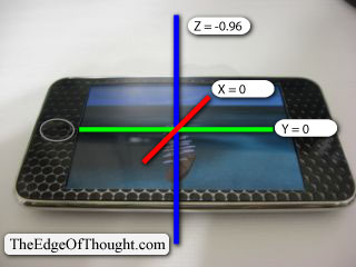
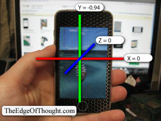
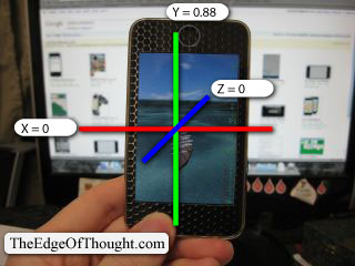
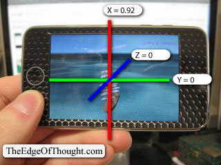
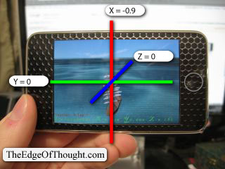
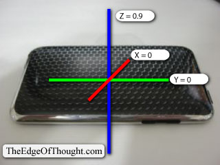
And now, comes the final bit of useful information, the pictures.

Basically, the pictures show the values of x, y, z,  for the 6 different orientations.

The way I personally interpret this is by way of the relative positions of one side to its opposite side.  The screen and the back are Z sides, the top with the lock button and bottom with the dock connection are the Y sides, and the two left-right edges are the X sides.

iPhone face-down

iPhone face-down, z approaches 1

iPhone face-up

iPhone face-up, z approaches -1

iPhone portrait

iPhone portrait, y approaches -1

iPhone portrait upside-down

iPhone portrait upside-down, y approaches 1

iPhone landscape right

iPhone landscape right, x approaches 1

iPhone landscape left

iPhone landscape left, x approaches -1

Until I wrote all this info down on paper, exactly as it’s described here, I couldn’t figure out how to interpret weird angles.

I had to do this research because the pre-packaged method for detecting orientation-changes was causing my app to jump back and forth.  Probably has to do with the update frequency too.  But this way now, I can build my own custom orientation code.

Take care everyone.

Posted in Technology | Tagged , , , , , , , , , | 2 Comments

The “freemium” business model.

From Wikipedia’s Freemium page:

Freemium is a business model that works by offering basic Web services, or a basic downloadable digital product, for free, while charging a premium for advanced or special features. The word “freemium” is a portmanteau created by combining the two aspects of the business model: “free” and “premium”.

There are hundreds or thousands of games on the Apple AppStore.  The popularity of it is rising according to numerous reports, and probably it is a very profitable model.  I just heard of the term and so looked it up.  It seemed fairly obvious given the context: a review written for an iPhone game, talking about the free nature and how the extra features are paid (something this particular reviewer did not like).

So, now the question of the moment: should this app I am developing follow the freemium model?  I don’t think I can answer that during the time of this blog post writing, but I will give it some writable thought.

A freemium app gives the public something to try-before-you-buy, but the Apple acceptance for new apps to the AppStore requires all apps to provide a “complete” product, even if it is minimal.

Pros:

  • You can get more initial market penetration
  • Possibly take advantage of alternate marketing techniques.
  • “Free-buyers” may be able to customize their experience of the product in the extensions
  • Coming from the previous point, the buyers may find their experience enhanced by a product that can interpret specific combinations of extensions, for example: a car-building game, buying a “racing stripe” paint job and an “air foil” extensions separately may each add individual looks or enhancements to speed, but together they gain a bonus, a synergy from the two.

Cons:

  • The product’s “extras” that are premium may not be accepted as “worth the money”, and a greater majority of people may consume the product’s free version, and then carry on with the next shiny thing that catches their eye.
  • The “extras” require specific development that extend beyond the core “Free” product scope.  More levels, more characters, etc, cost more time and money to create.
  • A buyer may be surprised to find “extras” that he or she, individually, naturally expects as part of the “Free” product, and complain or spread bad reviews complaining about “premiums that ought to be free”
  • An update to the free product that requires the previous purchase of a (very) popular extension should only be publicly released after making the popular extension become part of the core free product.  The Apple AppStore’s in-app purchases feature does not permit game logic upgrades, but does permit static data files like artwork (decals) and 3D models (new cars or whatever) and sound.  No new multi-player features, however there are ways around that…  So, realistically, an update to the free product that requires the previous purchase of an extension should not be an update to the free product, rather it should be a paid extension, perhaps one that absorbs and eliminates the previous popular extension

After this analysis, it seems the benefits are all mostly in favour of the end-user, and to a lesser extent, benefiting the company/developer.  The Cons are all weighing more heavily on the company/developer.  There are no major cons to the end-user except for those people who have personal expectations of extra free things, and the free-release of previously paid for products.

I like the idea of the fremium model, and may chose it but for now, the core game must completed.

Posted in Technology, Thoughts | Tagged , , , , , , , , , , , | Leave a comment

Progress in movement algorithm design

The album Bolero Gypsies: new flamenco is playing in my ears and the book iPhone cool projects from apress is spread open on my lap and I am typing a blog update on the iPod touch.

The chapter in the book I am reading is about the subject of networking. This may be getting ahead of myself, but it’s good to know for when the opportunity presents itself, and it will.

Yesterday, I created the movement of one of the principle game assets that will be moving constantly in the game. Let’s call this object a “bird” (it’s not in the game, neither is it in the air but it serves for this explanation).  The movement requires intelligence, not merely a simple movement like a rotation of some degrees on every game loop (eg. coins in Super Mario games or rings in Sonic the Hedgehog games). The game world may be large when the game is finished. The first draft for movement has become the following: a “home path” in the same style of the common footpath worn by animals in their native environments, when they travel the paths frequently. So it is with this movent. A path throughout any part of the game world.

This path is achieved by using a number of data variables.

The most important is the array of “checkpoints”. These are the same as checkpoints in a racetrack. In my first version of the movement system, the checkpoints are created as cubes in the world 3d model file, with special object names and serial number prefixes, such as “homepath001”. The name is searched and all the points are loaded into an array.

After the array, the most important variable is for storing the index serial number for the checkpoint the bird will be moving toward. Optionally, this destination may be interupted an replaced with any arbitrary location and the bird will move toward there instead.

Now, storing the index value of the next checkpoint allows us to determine the direction of movement whenever we want to. So now, this permits us to consider other random travel destinations.  If any arbitrary destination is chosen at anytime, another variable must store the yes/no status indicating if the object is moving toward the next checkpoint or not. So this possibility brings the necessity of another variable to store the actual destination location instead of only referencing the next checkpoint from the next-checkpoint-index. When the next checkpoint is reached, the index of the next checkpoint is updated, and the location for the new next-checkpoint is copied to this destination as the default destination.

This is just the tip of the iceberg.

Assuming movement toward some arbitrary location is part of the object’s life cycle, not only following a path forever, then it stands to reason to store not only the next destination separate to the next checkpoint as we’ve discussed, but also store the current home-path-location of the bird as soon as a new, arbitrary, destination is created. This will give the bird next-destination options to choose between, when it reaches the arbitrary location.  It may chose to return to it’s home path from where it left the path, somewhat tracing it’s path backward. Or, it may choose to continue to the next checkpoint directly.

In the case of the city pigeon bird, a home path might be the path around a large office building, and its checkpoints are lamp posts and parking lots (it may choose to walk in a parking lot).  When it is anywhere flying or walking, it may decide to go look at something away from its path, but it will try to keep its home building in sight, and if it decides to return, it can go onto wherever it wants, in the direction of its home!

Having more options is always a better thing than few options or only one.

Following this, I have implemented bezier curves for a smooth transition from approaching one checkpoint to the start of the next checkpoint’s path.  It doesn’t work well if a bird (or any other creature) is moving in a straight line and then instantly is moving in a separate direction..

Never before have I worked with bezier curve equations, so it’s brand new.  But I got the equation from Wikipedia’s page and plugged it in, and now it works.  This is a complicated issue, and not really part of algorithm design, but of implementation.

That will remain for some other day.

Posted in Technology | Tagged , , , , , , | Leave a comment

Today: learning and doing activities. Tomorrow: repeat.

Today has been a day of guitar-playing, reading, interpreting, typing, mouse-clicking, and dragging.

I built a 3D model of the Bahamas islands plus Turks & Caicos islands. I am using it as the sample of a 3D islands world in my iPhone game project. This is fun! Building in 3D is new to me, but things don’t go in one ear and out the other in this sort of subject. There are SO VERY MANY things to learn in Blender, because it’s not a user-friendly 3D modelling program. I didn’t know that when I started learning it, but now I do know it.

I got into using it from someone’s internet article of 3D and 2D graphic rendering engines for iPhone and iPod touch (and I suppose now, iPad). The person had SIO2 and Oolong as the top two ranked options, but in pros-and-cons, listed Blender as a con for SIO2.

But that’s probably because like me, that person had no experience with 3D art and modelling.  Anyway, I spent the latter half of January going through Blender 3D: Noob to Pro, and have progressed about 40-50% through it.  I should really finish, except SIO2 does not fully support everything, and I’m trying to catch up to the 40-50% full competency of SIO2  before going on with more complex Blender subjects (like animated armatures).

So anyway, going through the tutorials in the source code is what must be done, not reading step-by-step how-to documents.  This is a guerilla-style learning.  Gotta get my feet wet by jumping in 100% and swim with the sharks.  Not that anyone associated with SIO2 is a great white shark, more like very pleasant whale shark… that sounds really odd, but I’m tired now.

When complete, this project will be a lot of fun (I hope!).  A lot of ideas come to me when I’m in a lucid state, so immediately in the morning before I am out of bed and just sort of coming out of unconsiousness, I try to figure out what ideas are lurking.. at the edge of thought.  Collect them up!  They’re worth money in the right hands, my hands!

Posted in Activities & Adventures, Technology, Thoughts | Tagged , , , , , , , , , , , , | Leave a comment

Problems with iPhone device provisioning

Before working on the iPhone, I have only a day or two’s experience with secure certificates.  The SSL certificate I bought for a web site took a day to buy and another day to setup.

Now, I am dealing with these secure certificates again, and it’s a bit challenging because of my lack of experience!

The task at hand: get Xcode to properly upload one of my apps for testing on the iPod touch.  I think the provisioning is giving me troubles, or something else is.   When I tried to build an app I downloaded as a tutorial, it had someone else’s name in the configuration for the device, so I changed it to my own and also included the certificate, and it still kept telling me the other person’s name was in the configuration.

So I stopped trying to use that tutorial project, and went back to my own, and discovered that Xcode is bugged up.  I try to build and run, setting the device as the Active SDK.

And it uploads the app, but if I am running the debugger, and I click build and debug, it uploads, but gives me an error saying “Failed to upload the ___ app”

Then I look at the iPod touch, and the app is sitting there.  I delete the app, repeat the process, and it’s exactly the same as described.

I’ve checked every single Build-Debug configuration setting and they’re all proper, so I know the issue is not there.

I’ve just finished restarting the iPod touch, and the results:

Failure.

I’m really puzzled.  Possibly some other file is causing me grief.    I created a new test project to verify Xcode can still upload and debug, and yes, it can still upload and debug.  So, there’s something buggy with the app.  Cleaning the targets doesn’t help either.

And this issue has started since testing this other tutorial app out.

EDIT: I have solved this issue after checking google a second time.  First time searching for the problem did not give any success, but second time I found this: Failed to upload XXX.app

More information: The location of the name of this other person was in the Code signing area of the TARGET, but not of the PROJECT.    That’s solved now.

Posted in Technology | Tagged , , , , , , , , | Leave a comment

Documentation and 3D game engines

I am progressing slowly but surely. The 3d rendering engine for the iPhone that I am using is called SIO2. I am finding it slow going because the documentation is not what I call good. There are no step by step procedures in the tutorials and the reference doc materials are very raw, with no clean summaries,except those on the front page of the website that describe, in point form, the most general capabilities. Those capabilities are great,but after putting in the time to download the engine and try out the tutorials, I am coming to a question: is a pre-existing system better than developing a system in-house, if the existing system is so time consuming that the learning curve is almost as long as the development process?

Here I am frustrated with the lack of good quality and complete learning materials, but the existence of the system is still better than developing my own system. That is because in the time it would still take to devlelop my own thing, the existing thing may (or may not) improve, and in other cases I may find some help that I had not found at first. So the learning of an existing system is better.

This experience is going into the heaping pile of experiences of bad documentation for products I have seen. There is a wiki, and I might start contributing to it.

Going forward in the future, the skill to produce good documentation may become a very valuable transferable skill in the workplace. It seems very boring in some product contexts, ie. Vacuum cleaner manuals, software application manuals, inflatable air matress instruction sheets. Yet this world needs a better, universal, written method of learning that appeals to the reader. Something like google’s API doumentation, and apple’s iPhone and iPad documentation.

Posted in Technology | Tagged , , , , , , , , , , | Leave a comment

Defining iPhone game app scope

I’ve had a bit of annoying troubles today. Not a whole lot, but a bit. I’ve gone through them after a bit of stress.

Classical music does wonders for slowing down and calming my super-fast reading eyes, that my mind can’t keep up with. It also brings a bit of patience. So tasks may be done.

And I didn’t start listening to classical music until around 7:30pm. heh.  Earlier in the day, I built up a document of screen names (eg. load screen, main front screen, instructions screen) and the contents and behaviours on them, from a number of existing iPhone game apps. Using these notes as a starting point for constructing the outer scope of the game. With them, it becomes much easier to see where everything fits from a top-down perspective.

Posted in Technology | Tagged , , , , , , , | Leave a comment

UIKit’s UIView Hierarchy

Tonight I decided to put together a printable document built from the iPhone Dev Center’s reference for UIKit.  This document includes three sections (class name + overview section + tasks section) for UIView, plus all subclasses of UIView that appear in the hierarchy tree diagram in the UIKit framework reference.

That’s a mouthful.

Simply put: this document is a condensed, reader’s-digest version of the class references for every visible piece of an iPhone app (not counting custom crazy OpenGL apps and custom drawn stuff. heh)

There are a lot of things available even before getting into the custom drawn things, so to read it all in a nutshell, I copy-pasted all the text and edited it to fit to pages and be nicely readable.   The document is a PDF.

Click here for the UIView class hierarchy plus UIApplication and UIResponder

Posted in Technology | Tagged , , , , , , , , | Leave a comment